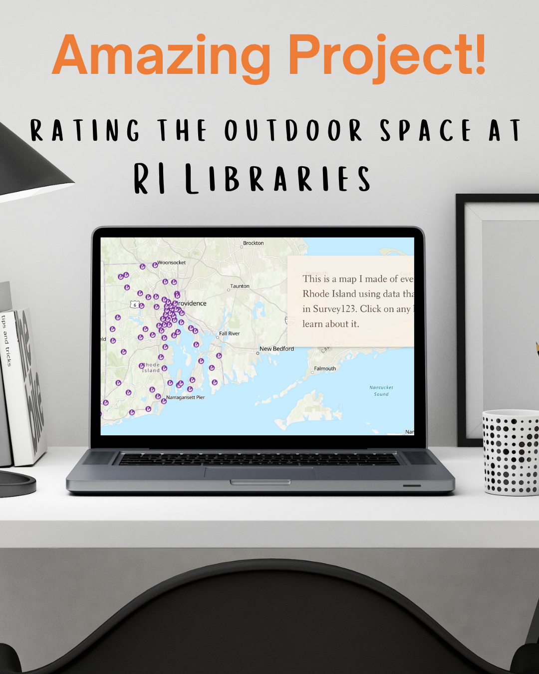
Media Literacy - Learning about Graphs and Statistics!
Two Resources for Teaching Statistics
There’s lots of discussion these days about media literacy and teaching our kids to question, interpret, and understand the information that is presented to them. Some of the trickiest information to dig into are graphs and statistics. What is the graph trying to depict? Where did the data come from? What is left out? Who created the statistic? There are so many questions!
One approach to getting kids comfortable and proficient at deciphering this information is through practice and I have two (free!) resources that will help you do just that. The first is from the
United States Census Bureau and the other is from the
New York Times Learning Network.
The U.S. Census Bureau has a resource called
Statistics in Schools which includes lessons, activities, and games for students from Kindergarten through 12th grade. There are quick data visualizations like this one for elementary kids on
National Pet Day and veterinary careers and there are also complete lessons like this one on
the setting of the novel, To Kill a Mockingbird, which goes in-depth into understanding poverty levels in America in the 1930s by using data from the 1930s Census Questionnaire and the 1937 Unemployment Census.
They have organized resources by grade-level but also by subject area so you can bring statistical literacy into different areas of your studies. Of course, you can also learn about the
Decennial Census and its impact on society.
The second resource is from The New York Times Learning Network and is called “What’s Going On In This Graph?” Each week of the school year they share a graph, map, or chart, and invite students to think about it and, if they want to, share their thoughts. Then on Wednesdays, the New York Times partners with the American Statistical Association to host a live moderated discussion about the graph and on Thursdays posts more detailed background information as well as the graph for the next week. There’s also “What’s Going On in This Picture?” which is also fun!
The last “What’s Going On In This Graph?” for the 2023-2024 school year was entitled “Hotter Summer” which talked about changing temperatures in the United States. The in-depth explanation covered questions the students may want to consider, other data that could be looked at to research claims, how density plots are different than histograms, what choropleth maps are, and the difference between normal and skewed distributions among other topics.
This resource is geared towards middle and high school students but could also lead to fun discussions or conversation starters with younger kids.
There are plenty of ways to use resources like these. I personally like sprinkling resources into our homeschool periodically. I’ll keep an eye on the NY Times site and if a topic comes up that we’ve talked about or that I know my kids are interested in I’ll add it to our morning discussions that week. We’re studying American History this year and I’ve found resources from the Census site that will be a nice complement to a couple of our units. If you have a child who loves graphs and statistics I could also see using these weekly as a study of statistics itself and looking at different topics each week. However you decide to use them, these resources will bring an engaging approach to statistics to your studies!
Share Article
Discover More